
Flux logo design
Inspiration
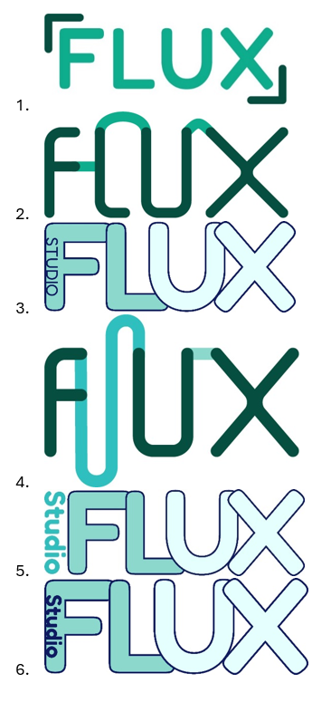
When we were thinking about ideas for our logo for Studio FLUX, we started with why we chose the name “Studio FLUX”. The FLUX part can be seen as 3 parts: FL, UX and FLUX itself. “FL” would stand for Flow, UX is the abbreviation of User Experience and FLUX itself is already an existing word. Because of the flow part I wanted to try making it so that the letters would flow into each other.


Here is the inspiration I had; this is an already existing logo of a design company also called “FLUX”.
I really like how the letters flow into the next one and it’s fluctuating so that it fits the name of the company.
Logo user testing
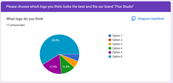
We wanted to test the logos we had made so far, so we used google forms to make ask this to a bunch of students that sat in the oil. These are the results of the google forms we sent. We also had a question that they can state why they chose that option
From this user test we found out that the logos with the gradient colours flowing into the next letter was perceived as the best :P We also had the option to state why they chose that logo as the best and here are some of the answers.
(note that some are translated from Dutch to English.)
 we looked into what actually makes a user test reliable and valuable. During a conversation with our teacher Penny, she emphasized the importance of having a sufficient number of participants to draw meaningful conclusions. According to her, aiming for 20 respondents is a good benchmark for surveys like this.
“I think this is the best option because the word “Studio” is in the logo itself since you want to let the people know you are a studio”
“in some of the logo’s the letters can be read differently (this can be fixed by using different colours in the logo). Also since you as a studio try to incorporate humour, try something funny in the logo. Also check if the colour palette has a good contrast.”
Reflection:
Conducting this user test helped us see our logo designs from an outsiders perspective. It was good to learn that the logo with flowing gradient colours stood out most to our target audience. The feedback highlighted how small visual choices like legibility , colour contrast, and the inclusion of the word "Studio" can impact how a logo is perceived as otherwise it is not clear that we are a Studio. If we were to do surveys again, we will aim for over 20 people since then we know for a fact is has a good amount of people for the user test to be reliable.
Logo usage
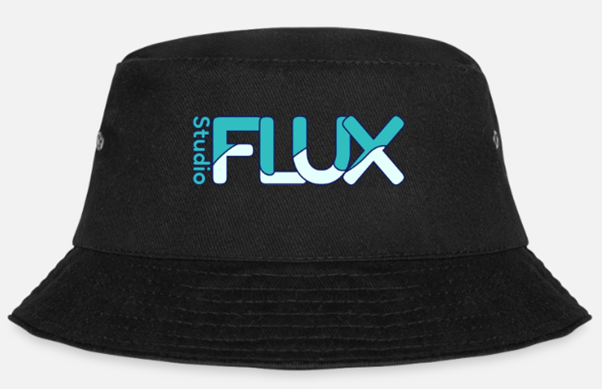
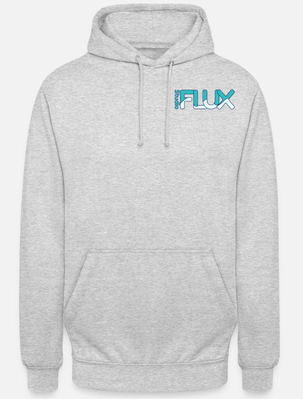
When the logo was made, I had the Idea to put the logo on some merchandise, Cecilia followed up on this while I was busy with User testing. But I didn’t want to bring an idea to the table and have nothing made with that Idea so I photoshopped the logo on a hoodie and a bucket hat.
We used this for the presentation to represent our brand as more professional, just like other companies have merchandise. We added a joke that if the studio thing doesn't work out, we can always start a clothing store :D
Portfolio Design 🔗
Inspiration
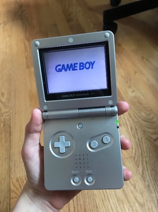
In Figma I made a design for my portfolio. I have recently fell in love again with my old Nintendo Gameboy advance SP (also known as the perfect handheld Gameboy) so I thought maybe I could implement that rekindling love for Nintendo in my portfolio.
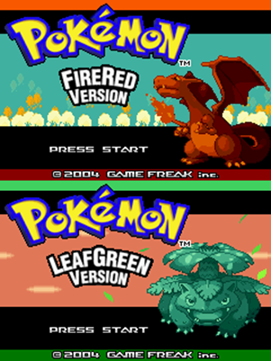
One of the most nostalgic feelings I’ve felt was starting the game console, that is older than me by the way, and firing up Pokémon Fire red and see the classic “Gameboy Advance” logo.
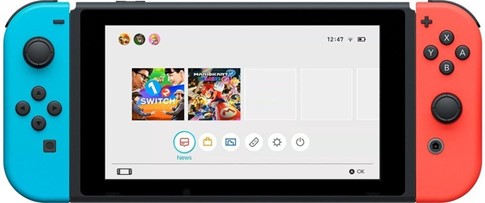
This brought me to the idea of making a Nintendo style portfolio. I don’t want to overshadow my content with a crazy portfolio design, so the Idea of making a small Pokémon game as a website is both out of my league and it does not fit the requirements of the portfolio. But what I do have in mind is making a Nintendo switch home screen as a website, and when you load the website, it plays the Nintendo switch animation of the 2 controllers connecting.
I talked with Mikeal about this idea (since he also really enjoys retro gaming and he brought a Nintendo Swich to school a few times) and he really liked this idea. If done correctly this would be a very good way to create a fun portfolio for my learning outcomes this semester, and it will be done in a theme I really enjoy
Reflection:
I was really happy to hear that the playful concept I had in mind struck the right balance and didn’t distract from the content. This recognition gave me a big boost of motivation and reassured me that combining creativity with structure can really enhance the user experience. This proved again that making something I really enjoy, helps with my motivation to actually get it done!
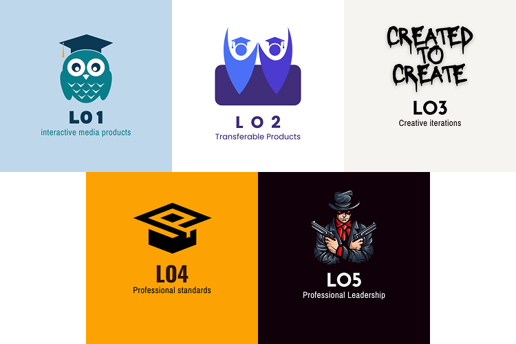
Game Logo concept
To transform the familiar Nintendo Switch home screen into a functional and engaging portfolio, I came up with the idea of replacing the game icons with my learning outcomes. Each "game" on the screen represents a different outcome, which not only keeps the nostalgic feel of the original interface but also turns it into a clear and structured way to present my work. By doing this, I’m combining a playful, recognizable design with meaningful content
I made some logos for learning outcomes, with each of the images representing what I think of when I think of that learning outcome.
For most of the logos I used icons I found on Canva to create the Logo, but for learning outcome 3 I fully made it my own. I had no clue what to put as an image with iterative design so I thought of the thing we do when we are making stuff in the group project. We make a lot of little things just to have them and from there we look further into what actually fits us. That is why used the sentence "Created to Create" to show that way of working.
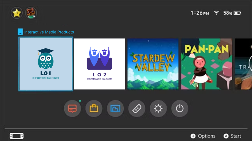
As you can see, the name of the official game will get changed to the learning outcome that you are hovering over. This also makes use of animations and JavaScript to get the transitions to be smooth.
This will be where you see all the learning outcomes so it's very easy to navigate. The buttons at the bottom will be changed to links to my socials and maybe other things related to me. This will be worked out further below!
While I was working on the Nintendo Switch-style layout, I discussed the concept with Dirk. They mentioned that turning the game icons into the learning outcomes was a smart and engaging way to make the portfolio both personal and functional. He also helped with the idea of the "game name" showing up when hovering over the learning outcome.
Reflection:
This feedback confirmed that I’m heading in the right direction. Using nostalgia and playful design to enhance the user experience, not distract from it. It reminded me that even bold, unconventional ideas can work really well.
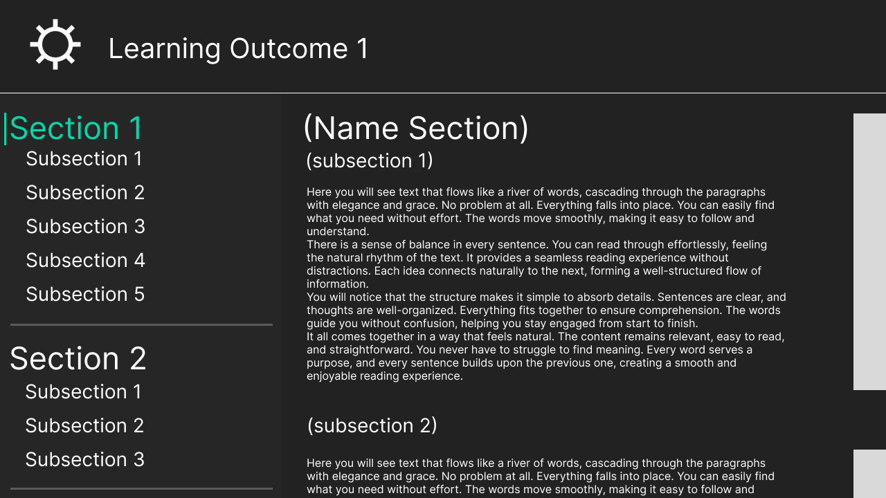
Layout concept
For the Layout of the Text of the learning outcomes I’ve taken the style of the settings page on the Nintendo switch. Here you can see the Learning outcomes and shortcuts u can click to automatically scroll to that subsection.
You are currently looking at this fully worked out.
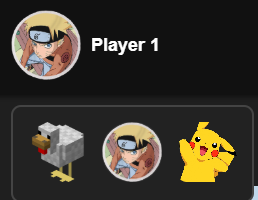
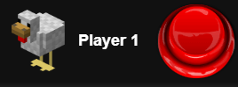
Character Selection & Easter Egg
I added a character selection to the Nintendo Switch home screen. I originally wanted to include a page where you could create your own profile, just like on the real Switch. But I also didn’t want to copy the original design one-to-one, so I’m still working on that.
In honour of the huge “Chicken Jockey” meme, I added a button with a chicken profile picture that plays a Chicken Jockey sound effect when clicked. Penny really enjoyed this xD
Marketing Videos
1st concept
Before I made these video's I did a bit research on what is good marketing nowawadays. The idea of making more playfull funny video's to promote something started with seeing TikToks of a very populair TikTok account called "LcSign". He's using a way of marketing no one else was doing at the moment and it worked like a charm. It is being runned by a man named "Tony" and because of his videos, the company accounts have gained over 10 million followers using video's that search the boundaries of funny and slighly offensive. The full research can be found in LO4.I created a concept video for the client, this would give them a better idea of what we are planning on posting on social media. I made it in Caput since I Really dislike Adobe Premier Pro.
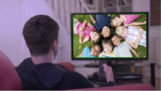
The video has a joke in it where the voice over says “Are you looking for minors” and then it shows this guy watching children on his TV. So I made the worst but also funniest photoshop I’ve made in a while.
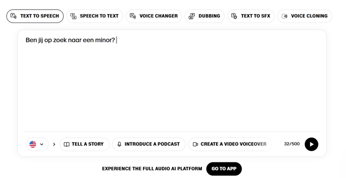
I used a site called elevenlabs.io to get a clear Text To Speech audio file to put into capcut to edit the video. You can choose between alot of different voices from all sorts of movies, series or other famous places.
For example, later in the project I'll use the voice of Peter Griffin for a different video.
At the bottom of the page you can find all the videos :D
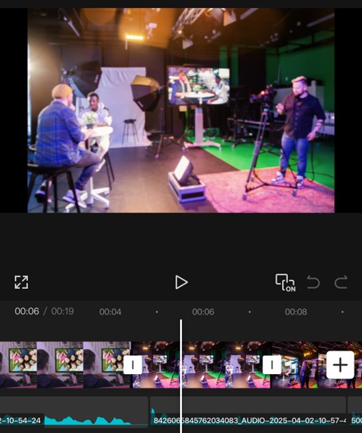
Here is a screenshot of me editing the video in capcut, I find this software much easier to use than Premier Pro. Since this isn’t that high of a quality video it doesn’t need to be made in Premier Pro.
2nd concept
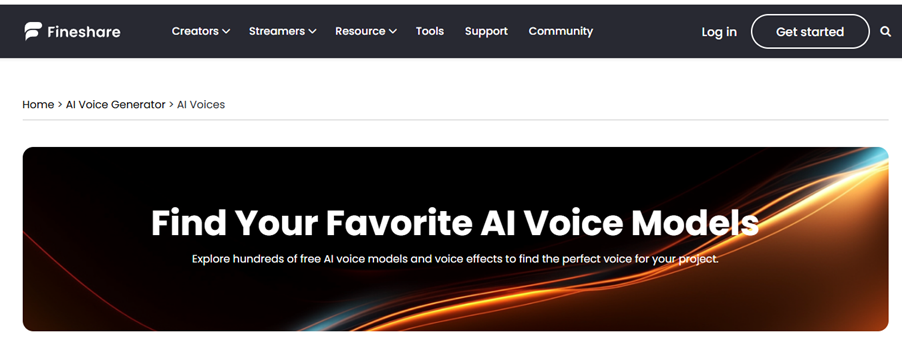
I’m making a few more short videos for social media, and I’m going to use AI more for the voice overs. For this im using a website called “Fineshare”, here you can find AI voices of over 1000 different characters and people.
I came up with an idea that includes Kendrick Lamar’s viral song called “Not Like Us”, it currently has 1.4 billion streams on Spotify and is used in over 2.2 million videos on TikTok. In the song he says “a minor” so I thought we can include that for our promotion of the minor.
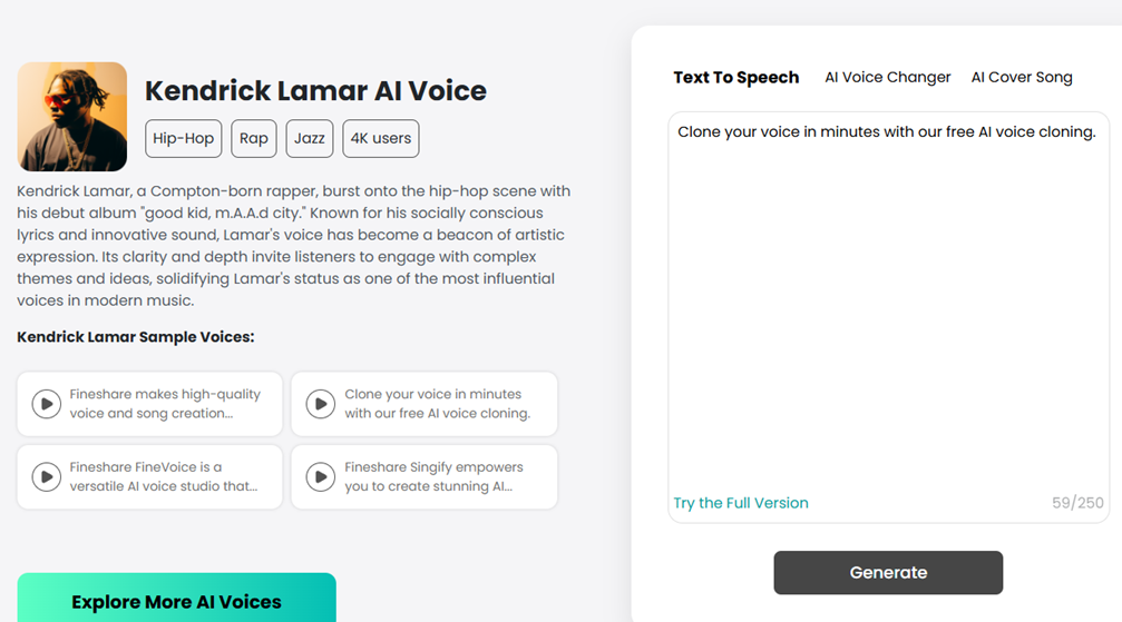
This is where you enter the text you want converted to sound in the voice of Kendrick Lamar. You are limited to a few thousand words and everytime you generate it changes a bit so I did a lot of generating and created a lot of accounts :D
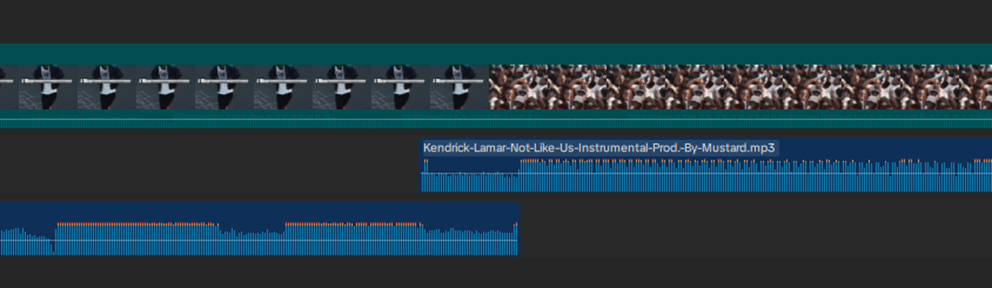
I then started working in capcut on getting the transition from the actual song to the instrumental perfect.
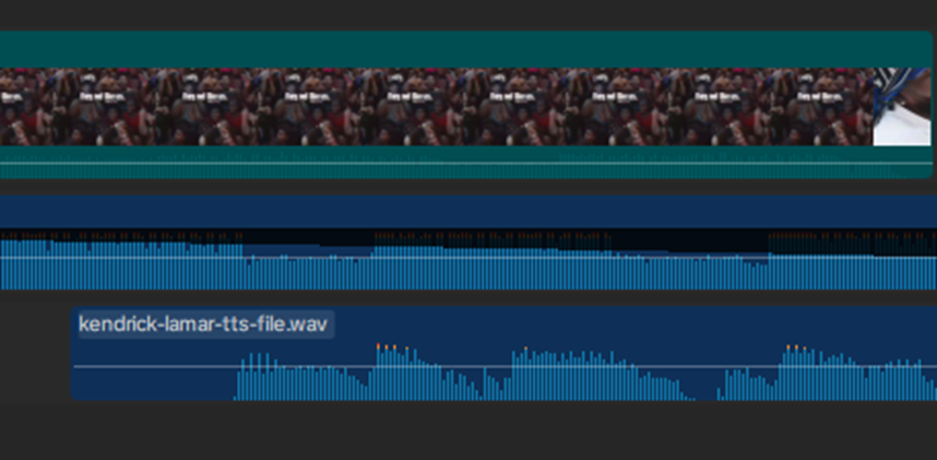
And also add the text to speech file for the AI voice of Kendrick Lamar so you hear him talking over the music.
I had to make some slight volume changes to all the sound files to have them all be at the volume level I wanted, for example the instrumental background music should be lower when the AI voice Is talking.
3rd concept
I made another video that continued with the “Are you looking for Minors” joke we had . But that Idea quickly fell in the water when we presented it to Teachers and they told us that it is funny but its not professional to post on the Socials of Fontys
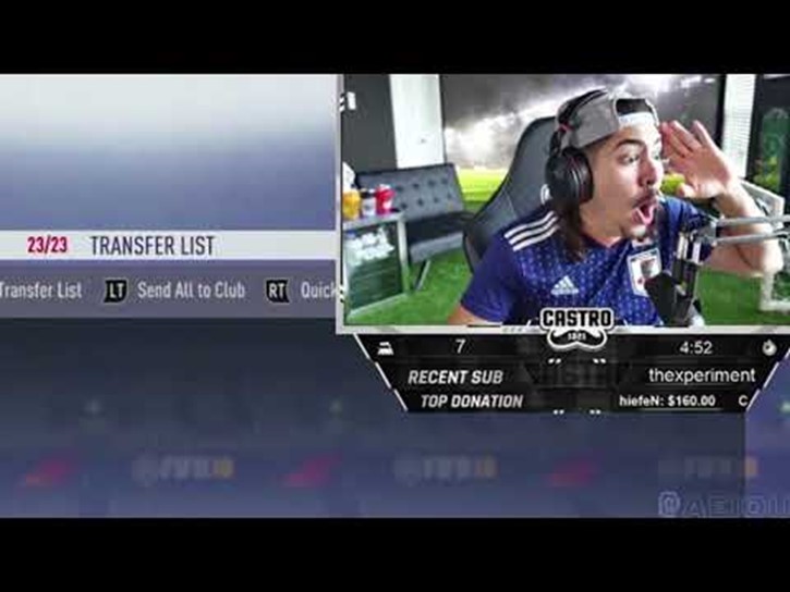
The process was a bit different than the first one, for this video I started off with a viral clip going around of a Twitch streamer making a big but hilarious mistake on his livestream. Starting off with a funny video is a good way to keep viewers watching your video and not scroll further.
this video also uses AI and sound effects that are used a lot in modern day funny videos on TikTok. The “GET OUT!!” sound and the Dog looking suspicious are staple in this era of videos.
4th concept
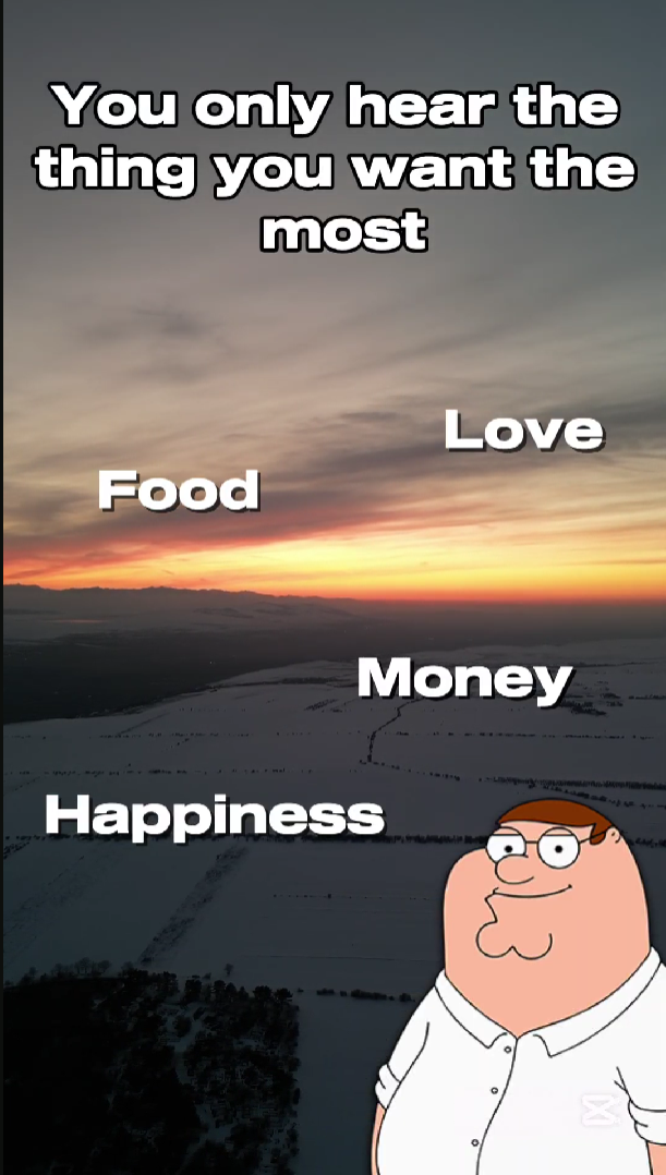
For this video I used a joke that is trending on Tiktok at the moment, you see a few words on the screen and you hear a voice saying "you only hear the thing you want the most." and then it says something completely different from any of the words on screen.
I thought I could use this to promote the minor! I'm giving it a fun twist by using an AI voice of Peter griffin from family guy.
This voice is also used alot in modern day tiktoks so this following the trend.
Reflection
While the short concept videos I created were well received during the presentations and people found them fun and engaging, they don’t fully align with the level of professionalism shown in the main video. Interestingly, the target audience responded very positively to these shorter clips, which shows that the playful tone did resonate with them. However, when looking at the portfolio as a whole, the contrast between the informal style of the concept videos and the polished, professional tone of the main video feels a bit inconsistent.
This experience taught me that it is important to define a clear visual and direction early on and sticking with that.
 Although this was fun to do and it works for other companies, I should've taken Fontys' professionalism into consideration.
Social buttons
In the middle of the page, under the learning outcomes, I want to add some buttons that link to my socials and other fun stuff.
In Figma I gave one of the circular buttons an “on hover” interaction, which I can easily replicate in HTML and CSS.